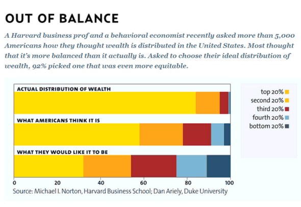
The distribution of wealth: perception vs reality
Posted: February 24, 2011 | Author: Alan Davies | Filed under: Miscellaneous, Social and community | Tags: Dan Ariely, equity, Michael Norton, wealth distribution |4 CommentsChart from Mother Jones. And here’s a link to the paper this chart came from, Building a Better America – One Wealth Quintile at a Time (it’s quite short).
-37.781700
145.039432

And if any party tried to make it even slightly more even, they’d be denounced by the same people as Islamo-commo-fascists and immediately voted out.
[…] Melbourne Urbanist’s Alan Davies links to this chart from Mother […]
Interesting how even in their ideal distribution, Americans think the richest 20% should get 30% of the wealth and the poorest 20% should only get 10%.
[…] The distribution of wealth: perception vs reality […]