The Melbourne Urbanist
Planning and development issues with a particular focus on Melbourne, Australia
The Melbourne Urbanist has moved to a new address (and taken a new name)!!
The Melbourne Urbanist has moved out of home and is now living in a share house. In true Aussie tradition, the new house mates have shortened my name to The Urbanist.
The entire blog has been moved to Crikey, so existing discussions can be continued there. All new posts now emanate from: http://blogs.crikey.com.au/theurbanist/
Recent Posts
- Is public transport the future of our cities?
- What should we do to civilise driving?
- Is this the hour of the two-wheeler?
- How will the pandemic impact public transport?
- Is High Speed Rail the game-changer we need now?
- Will the Western Sydney Aerotropolis really deliver on jobs?
- Is ending Melbourne Bike Share the right decision?
- Is labelling the outer suburbs as ‘job deserts’ helpful?
- Is Paris the right model for the Sydney of 2050?
- Should public transport fares be abolished?
- Do citizens really like road pricing?
- Should Shorten fund Melbourne’s suburban rail loop?
- Should Shorten fund Melbourne’s suburban rail loop?
- Is Labor serious about electrical vehicles?
- How desperate can the Morrison government get?
- Why is east coast High Speed Rail still being taken seriously?
- What would happen if public transport use grew faster?
- Why do (some) motorists think cyclists don’t have a right to the roads?
- Suburban rail loop – how can this mistake be prevented?
- Could powered two-wheelers be a game-changer for urban travel?
Categories
- Activity centres
- Airports & aviation
- Architecture & buildings
- Books
- Cars & traffic
- Cycling
- Decentralisation
- Education, justice, health
- Employment
- Energy & GHG
- Growth Areas
- Housing
- HSR High Speed Rail
- Infrastructure
- Management
- Miscellaneous
- Planning
- Population
- Public transport
- Social and community
- Technology
- Transport – general
- Uncategorized
Archives
- June 2020
- May 2020
- April 2020
- September 2019
- June 2019
- May 2019
- April 2019
- March 2019
- February 2019
- December 2018
- November 2018
- October 2018
- September 2018
- August 2018
- June 2018
- May 2018
- March 2018
- February 2018
- December 2017
- November 2017
- October 2017
- September 2017
- August 2017
- July 2017
- June 2017
- May 2017
- April 2017
- March 2017
- February 2017
- January 2017
- December 2016
- November 2016
- October 2016
- September 2016
- August 2016
- July 2016
- June 2016
- May 2016
- April 2016
- March 2016
- February 2016
- December 2015
- November 2015
- October 2015
- September 2015
- August 2015
- July 2015
- June 2015
- May 2015
- April 2015
- March 2015
- February 2015
- January 2015
- December 2014
- November 2014
- September 2014
- August 2014
- July 2014
- June 2014
- May 2014
- April 2014
- March 2014
- February 2014
- January 2014
- December 2013
- November 2013
- October 2013
- September 2013
- August 2013
- July 2013
- June 2013
- May 2013
- April 2013
- March 2013
- February 2013
- December 2012
- November 2012
- October 2012
- September 2012
- August 2012
- July 2012
- June 2012
- May 2012
- April 2012
- March 2012
- February 2012
- January 2012
- December 2011
- November 2011
- October 2011
- September 2011
- August 2011
- July 2011
- June 2011
- May 2011
- April 2011
- March 2011
- February 2011
- January 2011
- December 2010
- November 2010
- October 2010
- September 2010
- August 2010
- July 2010
- June 2010
- May 2010
- April 2010
- March 2010
Mid Mo Design.
- Comment
- Reblog
-
Subscribe
Subscribed
Already have a WordPress.com account? Log in now.
%d

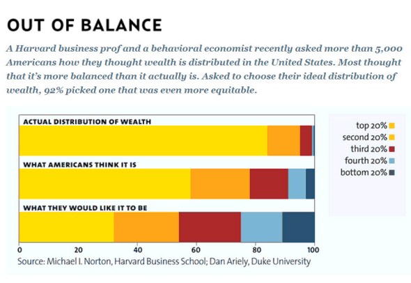
And if any party tried to make it even slightly more even, they’d be denounced by the same people as Islamo-commo-fascists and immediately voted out.
[…] Melbourne Urbanist’s Alan Davies links to this chart from Mother […]
Interesting how even in their ideal distribution, Americans think the richest 20% should get 30% of the wealth and the poorest 20% should only get 10%.
[…] The distribution of wealth: perception vs reality […]